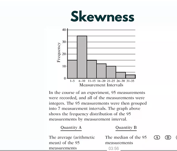
Hi, I recently came across these two questions. In the boxplot question the answer is that we cannot determine where the mean is. The way I think about it is that the values within each quartile boundary could be grouped at the very left - pushing the mean below the median. BUT, when Greg shows this skewness histogram, it is “obvious” that the mean must be greater. To me, these provide the same kind of information, only that the histogram is more granular/detailed. Couldnt the same argument be applied to the histogram, that the values within each interval are pushed all the way to left?
If you actually calculate the “extremes” case where the median is 10 and the mean of every number inside the intervals are the smallest value possible, the answer is still that the mean is greater. My point, however, is that this cannot be determined immediately or eye-balled.
Am I missing something?

