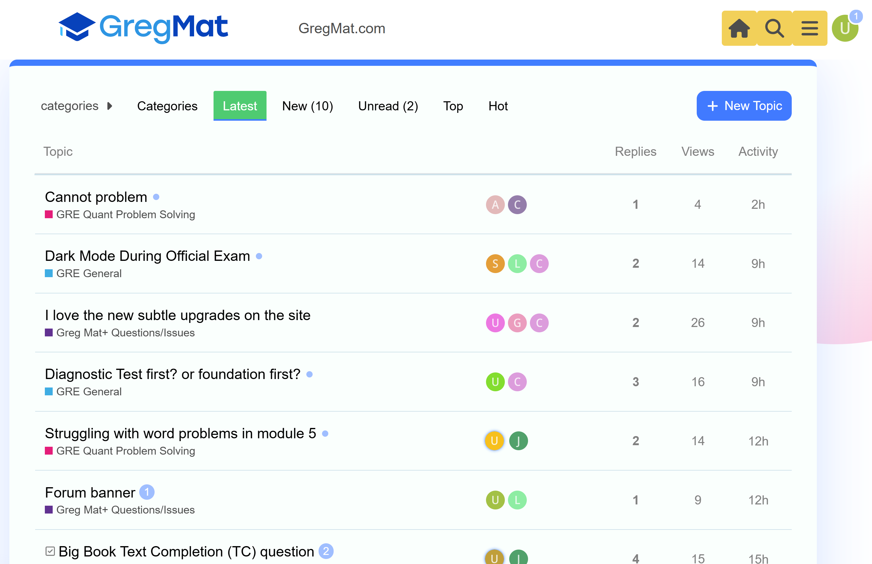
In general I’m finding the forum page navigation confusing and I often don’t know where a button is actually going to take me.
Most commonly, I’m constantly clicking the orange home button expecting to be taken to the page that is actually linked to the gregmat logo then having to go back.
There are two buttons up top that will take you to gregmat.com and only one that will take you to the main forum page, which seems unbalanced to me and makes the navigation cumbersome. Some user testing may be worthwhile to improve the overall UX of the forum navigation.