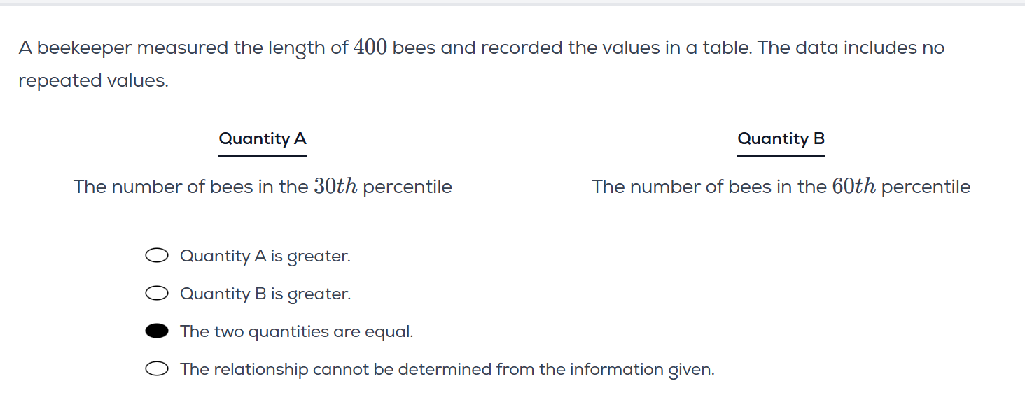
So I understand the logic of the answer for this, but just trying to understand the concept a bit better :
In a normal distribution curve, each percentile has a different frequency right ? (intuitive from the area under the curve at that point). Or is that not the case ? If that is the case, how do we reach at (c) for this question.
Hypothetcially, if a bunch of bees had the same length ( let’s say 300 bees), how would the graph look ? + which percentile do we say they lie in since there are so many bees, they won’t just cover 1 percentile range right and will cover most of the range ?
That’s not the case. The values are evenly distributed but the percentages are not. For example “0% to 2%”, “3% to 16%”, and “17% to 50%” all have the same width on the graph, right?
It would just be a flat line I guess, because all the values have equal frequency
Yes, but i’m sure this isn’t related to what u want.
For example, suppose an interval with range d corresponding to an area of 1% near the mean, and another interval with range d’ corresponds to same area of 1% far away from the mean. Then clearly d' > d.
As to what u want: percentiles are equally spaced in terms of proportion, not frequency. Informally, two data points could be “nearer” to the mean and thus be more densely packed than data points “nearer” to the “endpoints”, but both these regions still represent 1% (or whatever convenient) of the data.
The area under the curve tells you what percentile a datapoint is at.