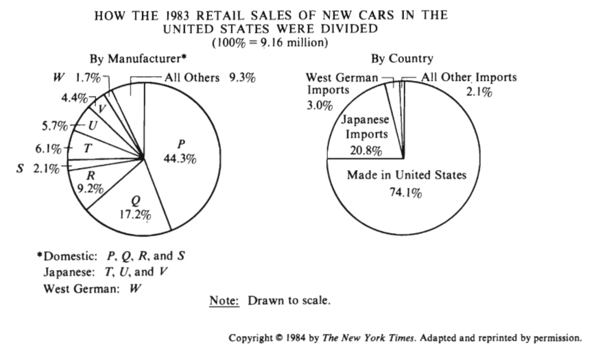
In this problem, the approach is to take 17.2% of 9.16 million, and then take that amount and put it over ~6,800,000, the approx. number of domestic cars sold in 1983.
My beef with this approach is that the “By Manufacturer” pie chart says that Q is 17.2%, and that Q belongs in “Domestic”. Shouldn’t this mean the 17.2% belongs to the ‘domestic’ portion of the bar chart?
Thus, in my opinion, you should not take 17.2% of 9.16 million, but rather, 17.2% of 6.8 million.
Domestic manufacturers amount for (44.3 + 17.2 + 9.2 + 2.1)\% = 72.8 \% of all manufacturers, so no Q is 17.2 \% of all manufacturers (domestic, japanese, and west german). As a guess, you can imagine that if we strictly look only at domestic manufacturers then Q constitutes a “larger portion” of them because Q manufacturers are held constant while we decrease our “population size” (from all manufacturers to now just domestic manufacturers). This guess alone leads you to the right answer of E because that’s the only option greater than 17.2.